
Measure Skilly's Success: The Team Health Scorecard
Like any teammate, you should be able to evaluate the activities and outcomes of your skilly in order to measure its impact and, if that impact is deemed valuable, find opportunities to expand its role. We've now made that evaluation even easier with the introduction of the Team Health Scorecard.
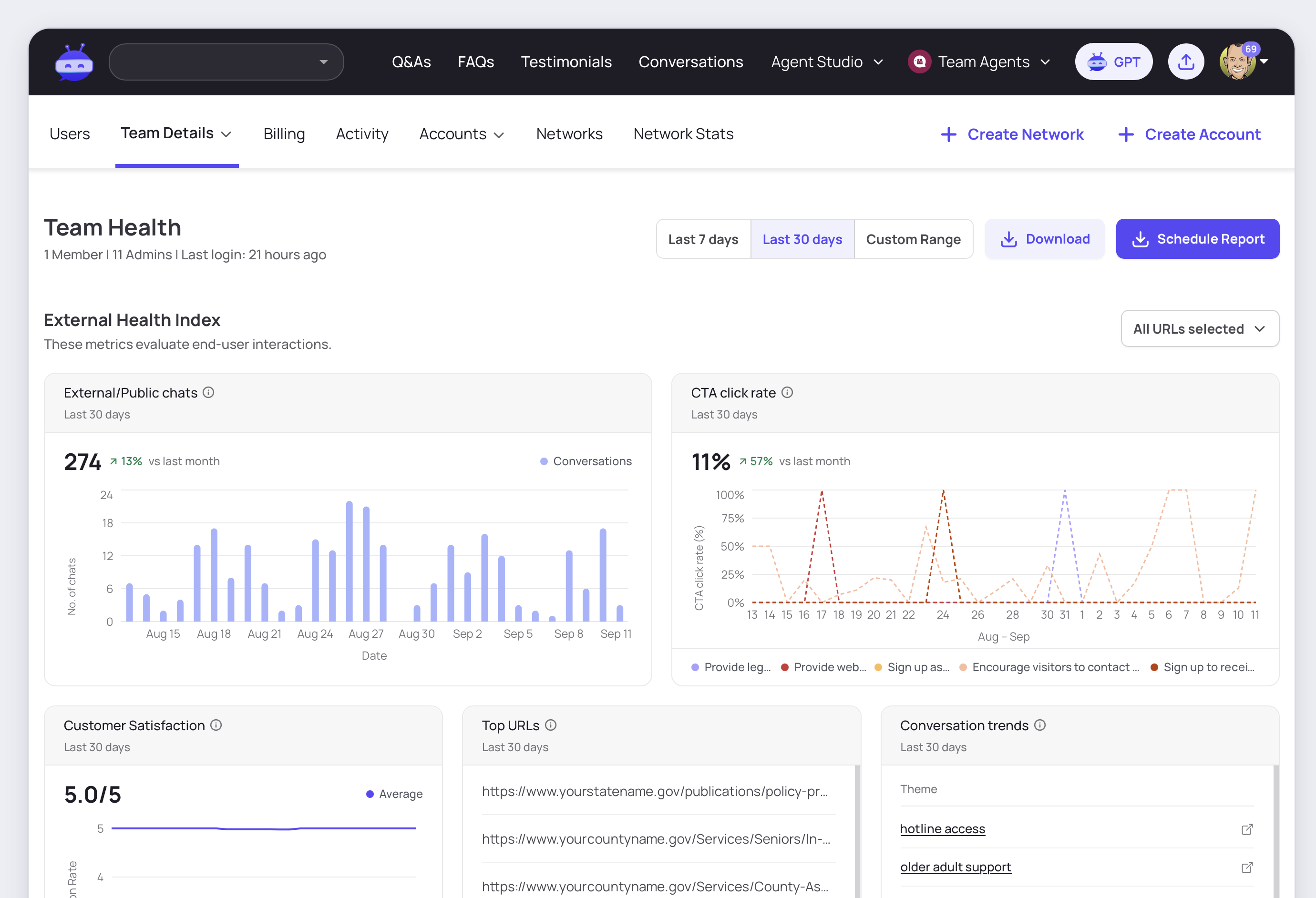
Here’s the executive summary of what you can learn and act on when reviewing Team Health insights, both at-a-glance and trended over your preferred timeframe:
Customer engagement insights
- External chat volume (total, by channel, and by individual agent)
- CTA click-through-rate
- Customer satisfaction (CSAT)
- Top referring URLs
- Top conversation themes
- Testimonial volume (total, and by individual input type)
Internal engagement insights
- Internal chat volume (SkillyGPT)
- Total team users
- Login frequency by team member
- Recent logins
- Answer freshness ratio
- Answer quality ratio
- Annotations overview
- Annotations leaderboard
- Annotations volume
Let’s dig into each chart for a clearer understanding of what the metrics are telling you, and what resulting actions you might want to take as skilly’s manager evaluating its performance.
External Chat Volume
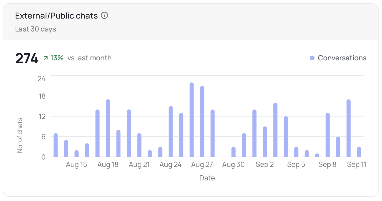
This is the simplest view of your skilly’s activity: if you consider skilly to be a customer-facing employee, this chart tracks & trends the volume of conversations it’s held with your customers. An up or down trend isn’t necessarily “good or bad”, but significant shifts in the trend indicate you may want to review more detailed charts like the Conversation Trends, while an abrupt drop-off of activity implies a technical issue worth looking into.
CTA Click-Through Rate
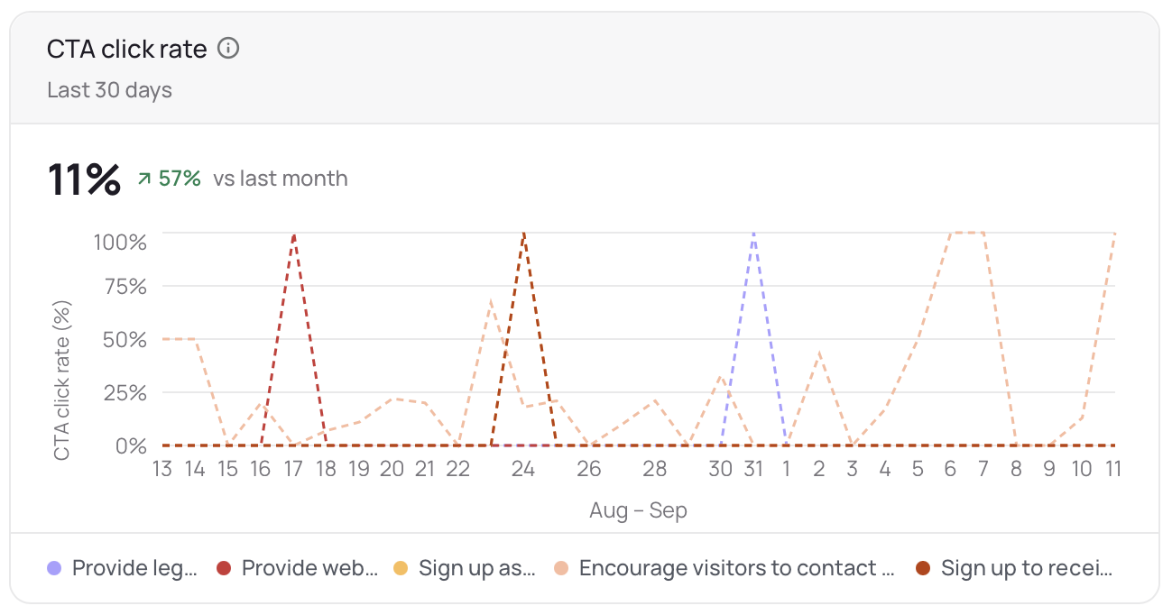
Skilly is trained to guide users toward your stated goals, which manifest as CTAs (calls-to-action) such as a link pointing to a signup form. This chart trends each of your most popular CTAs’ click-through rates, i.e. the ratio between how often the CTA was presented and how often it was clicked. If you spot a CTA outperforming the rest, it’s worth considering whether you might want to train skilly to direct more conversations toward that outcome.
Customer Satisfaction (CSAT)
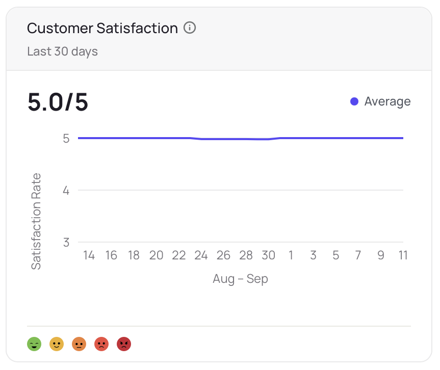
The skilly interface provides a simple, universally acknowledged five-step emoji scale for measuring CSAT, which is available to your users during and after their chats. This metric is used by thousands of companies as a basic pulse on customer satisfaction.
Top URLs & Conversation Trends
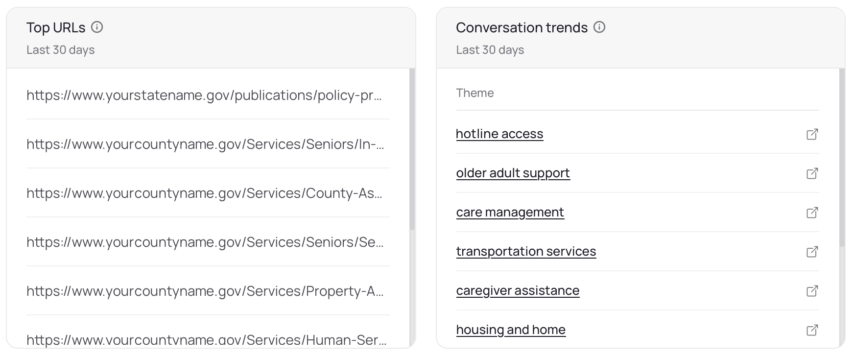
Top URLs list your most popular referring URLs over the reporting period: the pages or sources that have pointed the most users to your skilly. Conversation Trends is a rollup of the most popular themes in your conversations, as categorized or auto-tagged by your skilly.
Chat Volume By Agent
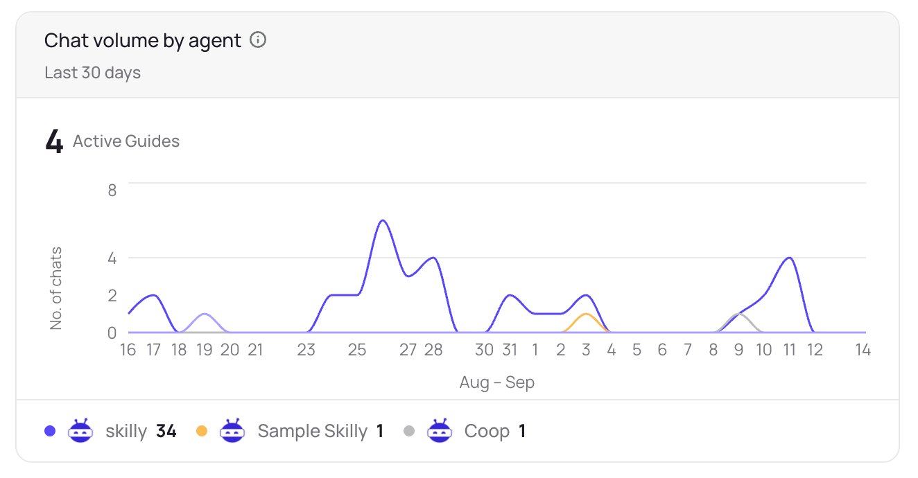
With the ability to create multiple skillies as a free feature, you can have different agents with different goals and personalities interacting with unique user groups. This chart breaks out your total chat volume by agent so you can see how each skilly is trending.
Chat Volume By Integration Channel
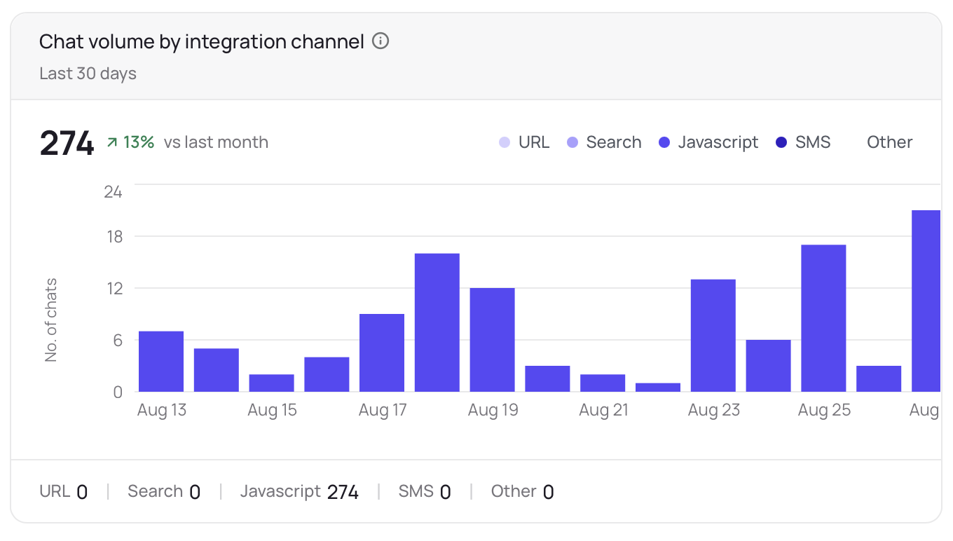
Given the myriad ways to publish your skilly, tracking which deployment channel has been the most useful can help you think about where to focus expansion efforts or launch an additional skilly. This chart provides insight into conversation volume by “channel”; for instance, showing how much of your skilly engagement is starting from your website’s search bar vs. text messages vs. the chat bubble icon.
Overall Conversation Health
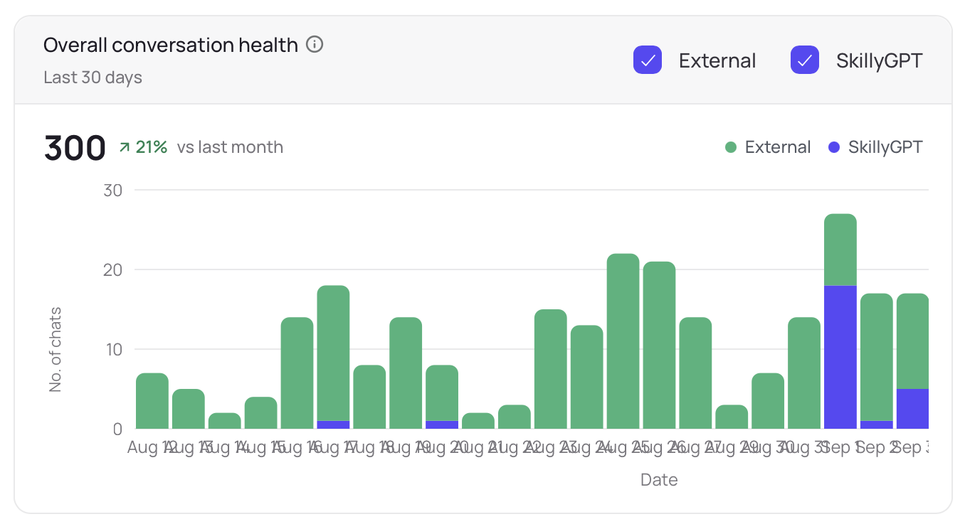
This chart headlines the internal section of the Team Health Scorecard: how your own team is engaging skilly. The Conversation Health chart trends the volume of conversations happening inside your organization, using SkillyGPT as a subject matter expert and training resource.
Total Team Logins
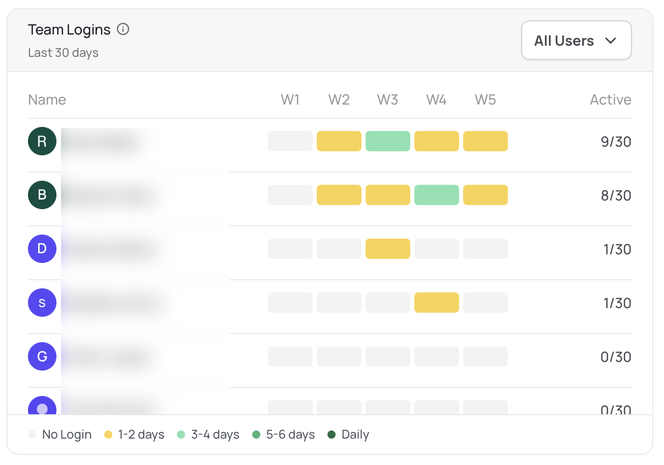
The Total Team Logins chart tracks teammate activity on a weekly cadence, with color coding as a directional indicator of how often each team member is logging into skilly.
Answer Freshness
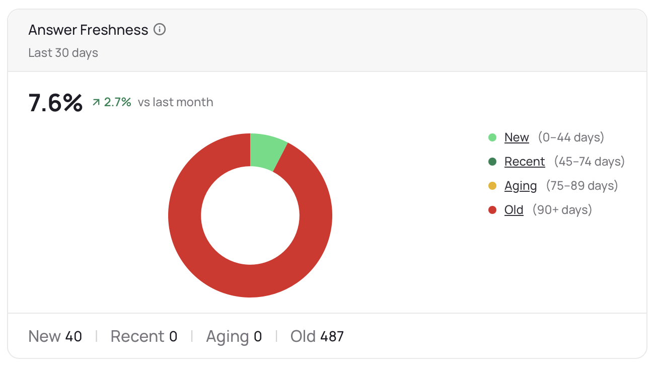
Depending on the content in your answers, age (or freshness) of the material you’ve trained skilly on can be an important factor in the success of user-facing conversations. This chart is a straightforward donut ratio of all your answers sitting in the knowledge base, broken down by how fresh the answers are (new, recent, aging, or old). From this chart, you can click into any of the aforementioned categories to view questions filtered by that criteria, and decide for yourself whether the information is due for a refresh.
Answer Quality
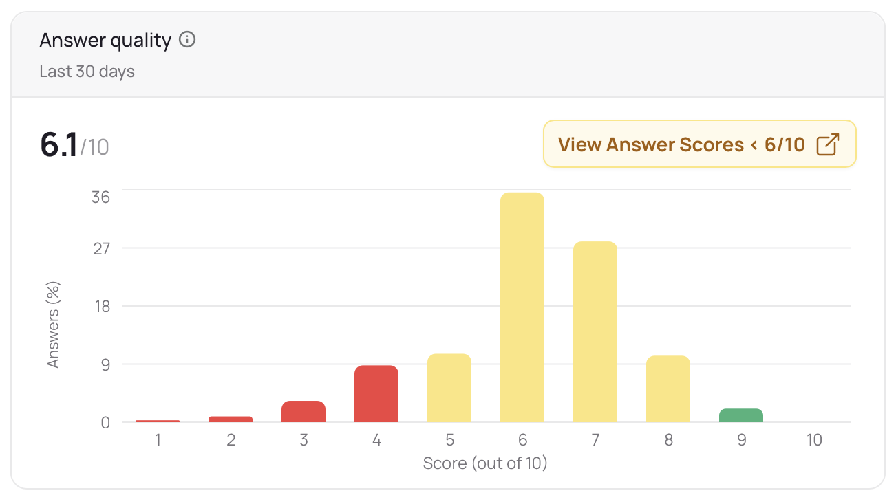
One of skilly’s most unique strengths is that it’s built on a foundation of Carnegie Mellon University research in conversational engagement, and as part of that skillset, it has a knack for reading the answers you’ve trained it on and using context to score those answers by their differentiation and impact. This is a great chart to dive into if you want your team to exercise its communication skills while working with skilly to improve the quality of your answers.
Annotations
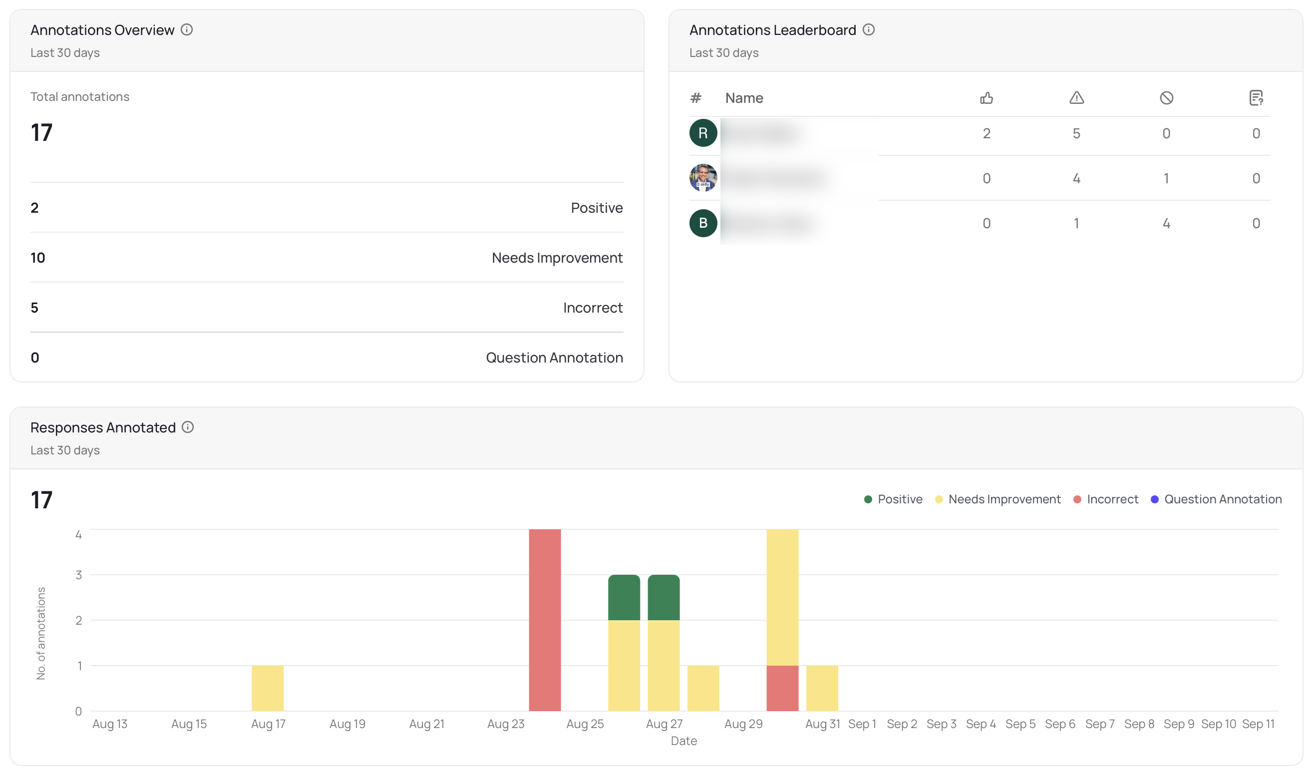
The Annotations overview, leaderboard, and volume tracker all contribute to insights on where your team members have left comments to bolster support for a high-quality answer, or provide feedback about an answer that needs additional review. Like other areas of the Team Health Scorecard, you can click into any of these sections to review answers filtered by those respective classifications.
This is just the beginning for Team Health insights, and we’d love to hear what’s working for you, as well as what future features of the scorecard you’d like to see! Feel free to reach out to your skilly contact, or catch us here.